Friday, 22 April 2016


Wednesday, 23 March 2016
Audience Feedback Vlog
Here is our vlog where we discuss the feedback that we received at our media showcase:
Wednesday, 16 March 2016
The Last Shadow Puppets - Aviation
Despite having finished my music video, I was intrigued by The Last Shadow Puppets' 'Aviation' that was released today. It comes as a continuation of the video that they released last week, 'Everything You've Come to Expect'. I previously wrote about how the first video was extremely ambiguous so I was interested when 'Aviation' appeared to be a continuation. Both videos feature the same location, a beach, and the same actress, who is wearing the same costume. This makes it clear to the audience that these videos are linked without explicitly stating so.
'Aviation' is set before the events of 'Everything You've Come to Expect'. Much of the mystery surrounding 'Everything You've Come to Expect' was due to the lack of a clear explanation as to why, or how, the artists were buried in the sand (below left). 'Aviation' shows the lead up. The artists are shown digging their own graves at gun point (below right), the 'why' is still not explained, however, it gives the audience some satisfaction in knowing that there is a partial backstory to the events of 'Everything You've Come to Expect'.
I thought that the idea of having linking music videos was very clever and is an idea that my group could have used if we were to create another music video. Videos with multiple parts are usually of the indie genre, like our music video, as these videos tend to be more narrative-based. Follow-up videos allow for, either, a more ambiguous video that can later be explained, or two videos that tell a more complex story that couldn't be told in the space of a single video.


Monday, 14 March 2016
Media Showcase
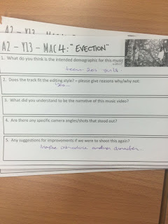
Today we held a media showcase in order to present our music video to our peers, teachers and family with the intent of receiving audience feedback. This allowed us the receive feedback from various demographics due to ranges in age and gender, this was helpful as we could see whether our product was versatile in appealing to different groups, other than our target audience of 16-24 year old females.
We distributed audience feedback sheets (example shown below) in order to gain answers to specific questions, such as what the 'intended demographic' for our music video was, whether the 'track fit the editing style, and whether the narrative was understood. We asked a wide range of questions so that we could gain feedback on all elements of our music video, from our editing to narrative to camera shots and angles. This range has helped us to see what elements worked well within our video and which needed improvement. This information will also be incredibly valuable during the evaluation stage.
We are hoping to film a vlog within the upcoming days, addressing the feedback that we received.

Here is some footage from the showcase, unfortunately, only the first three groups were recorded:
We distributed audience feedback sheets (example shown below) in order to gain answers to specific questions, such as what the 'intended demographic' for our music video was, whether the 'track fit the editing style, and whether the narrative was understood. We asked a wide range of questions so that we could gain feedback on all elements of our music video, from our editing to narrative to camera shots and angles. This range has helped us to see what elements worked well within our video and which needed improvement. This information will also be incredibly valuable during the evaluation stage.
We are hoping to film a vlog within the upcoming days, addressing the feedback that we received.


Here is some footage from the showcase, unfortunately, only the first three groups were recorded:
Thursday, 10 March 2016
The Last Shadow Puppets - Everything You've Come to Expect
Today the new music video for The Last Shadow Puppets' 'Everything You've Come to Expect' was released. I found it particularly interesting as there are 9 different versions that were uploaded to YouTube, 1 listed and the remaining 8 only accessible by following the link in the description box. This led to a lot of confusion amongst fans when the music video seemed to change with each viewing, some videos being shot at different times of the day and others containing different costumes. The result of these slight changes is an eerie atmosphere created by the familiarity of each video but with hard-to-determine changes.
I think that having multiple videos is very fitting for the song as it is fairly repetitive with its melodies and lyrics, particularly the repetition of the lyric 'everything that you've come to expect'. This line fits perfectly with the effect of multiple videos as the viewer 'comes to expect' certain elements in the video only for them to change, for example, two videos contain a woman playing a violin in the background and one video even cutting to black halfway through, shocking the audience.
Below is a video showing all versions simultaneously:
The music video conforms to Andrew Goodwin's music video theory. There is a clear link between the lyrics and the visuals, the lyric 'coastal air gets a girl to reflect' is shown through the beach setting and the lyric 'dirtbag ballet' is shown through the ballet-like dance of the woman in the video. The lyric 'I just can't get the thought of you and him out of my head' is also shown as the woman flitters between the two men (the artists) that are buried back-to-back in the sand. There is also a link between the music and the visuals due to the calm, slow-motion movements matching the slow paced song, this calming element is enforced by the beach location and the single, smooth take.
'Everything You've Come to Expect' conforms to the conventions of a performance video, with lip-synching and close-ups of the artists being included. However, unlike many performance videos, the artists play a secondary role here, with the woman being the main focus, many sections of the video not even showing the artists' faces clearly, if at all.
Overall, I think that the concept of these videos is extremely interesting as they have challenged the format of the music video whilst also generating publicity and 'hype' for the band's upcoming release of their album, also titled 'Everything You've Come to Expect', due to fan speculation on the 'meaning' of the videos. This shows how creative decisions and challenging conventions can have an impact on audiences and therefore publicity and future sales.
Wednesday, 9 March 2016
Friday, 4 March 2016
Music Video Titles
After receiving feedback on our final draft, we have corrected any lip-synching mistakes and are now happy with the finished result. This meant that that last thing to add before exporting the video was to add the song title and artist's name. We chose to use the same font that we used to write the artist's name on the front of our Digipak. This creates a link between the products and reinforces the artist's brand.
We chose to add the title in the bottom left-hand corner over the first shot. We chose to place it in the corner so as to not obscure the artist's face, again, emphasising the 'star image'. We also felt that the titles are not as important as the content of the music video, we didn't want to distract the audience from our shots, we therefore placed the title subtly.
The images below show our font, titled 'Birth of a Hero', appearing at the start of our music video (left) and on the front of our Digipak (right).


Audience Feedback
Today we received audience feedback on the final draft of our music video. We wanted feedback on what we could improve, such as lip-synching, however, it appeared that the class enjoyed the music video and they didn't offer any recommendations for improvement. As a group we are still noticing small details with the lip-synching that others don't seem to see or hear, this has lead to us spending more time perfecting the lip-synching but it has also become a form of procrastinating uploading our video. Receiving such positive feedback has finally given us the push to add the finishing details, such as the music video title, and then upload the video to YouTube.
Here is our feedback vlog:
Here is our feedback vlog:
Wednesday, 2 March 2016
Finished Editing
Today we finally finished editing our music video. We are planning on getting some audience feedback before we upload our video as we need objective opinions so that we can see what we may need to improve. We mostly need to see whether the lip-synching of our video is correct. Once we have received feedback and made small changes we will need to add the music video title and artist name at the start.
Here is our vlog from today:
Here is our vlog from today:
Friday, 26 February 2016
Editing Update
We have now edited about two minutes of our music video, this means that we are on schedule and should hopefully finish editing by next Wednesday. Our focus today was to increase the pace of our shots as we felt that some were too long and began to grow dull. It is important that we keep the audience interested in our music video in order to make it more appealing, the best way to do this is to have a variety of shots that appear in quick succession. As we don't have a strong narrative, we need to rely on good editing to help, not only in creating meaning, but to keep the music video interesting.
Thursday, 25 February 2016
Final Shot Inspiration
After abandoning our original idea of having the final shot of our music video be the performer exiting the maze in sophisticated clothing, we started to look at other options. We have decided to have a final shot that is the same as, or very similar to, one of the first shots of the music video. We wanted to create a video that is cyclical in nature, the idea of a 'cycle' alluding to our video's theme of being trapped and trying to escape.
The images below show one of our first shots (left) and our final shot (right). We felt that these help to make the narrative clearer, the first shot shows the performer entering through a doorway, the final shot shows her leaving or 'escaping'. We felt that this was a fitting shot as it is a clear end to the video - the performer walks out of the shot, leaving little room for confusion for our audience.


Another music video that has used this technique is Bear's Den's 'Above the Clouds of Pompeii':


The image of the hand is very important in this music video as it symbolises a connection, the video shows a dance between an elderly couple, this is a very intimate moment. The image of an empty hand is also very significant as the woman is shown to be in the man's imagination, the emptiness mirrors his loneliness. This music video showed me how a powerful starting and closing image can have a very strong effect on audiences as this makes the video more memorable. It also helps to solidify key themes, this was important to do in our music video as our narrative is quite vague.
Wednesday, 24 February 2016
Editing Update
Since completing our filming it has become a lot easier to edit our music video as we had previously left gaps where we needed our new shots to go. After adding our new footage from the Capel Manor Maze, our narrative has become slightly clearer, although it is still more implied instead of a clear storyline. We have finished editing the first minute of the song which leaves about 2 minutes left, this seems very manageable in the time that we have left until our deadline. We have placed the majority of the shots roughly where we want them the appear in the music video, however, we will need to go back and refine the lip synching and make sure that shots cut on beat. We also are yet to add special effects, such as our kaleidoscope shots or changing the opacity, we felt that these could be added at a later date whilst we focus on getting the shots and locations to 'flow'.
We also decided to change the ending of our music video. We initially planned to have a shot of the performer exiting the maze in professional-looking clothing, contrasting her previous grungy style and deteriorating mental state. However, when we added this shot at the end of the music video, instead of adding to the narrative and themes of reckless vs sophisticated behaviour, it made it more confusing. The shot lacks a connection to the rest of the music video, meaning that it seems to appear out of nowhere. We decided not to use this shot but are yet to find a replacement.
We also decided to change the ending of our music video. We initially planned to have a shot of the performer exiting the maze in professional-looking clothing, contrasting her previous grungy style and deteriorating mental state. However, when we added this shot at the end of the music video, instead of adding to the narrative and themes of reckless vs sophisticated behaviour, it made it more confusing. The shot lacks a connection to the rest of the music video, meaning that it seems to appear out of nowhere. We decided not to use this shot but are yet to find a replacement.
Thursday, 18 February 2016
Framing and Composition - Capel Manor Shots
 We used the rule of thirds when composing this shot. Typical of a performance video, we wanted the performer to be the focal point of the shot, and therefore, she appears along one of the 'thirds' lines. I like the balance created within this shot by the foliage emerging from the left-hand side of the frame, this also serves to accentuate the performer as she appears in the only open space in the shot. We felt that the structure of the window was grid-like so we used this to make the shot more interesting, by having the performer appear through a gap, a frame is created around her. This framing technique helps to draw the viewer's eye to the focal point - the performer.

In this shot, we wanted to centralise the performer to identify her as the focal point. The simple background also helps to draw attention to the focal point. We used the rule of thirds to calculate the composition of this shot so that we left a proportionate amount of headroom.

The interesting lines and angles within this shot help to lead the viewer's eye to the centre of the frame that contains the focal point - the performer. This was a hand-held tracking shot, these lines that 'draw you in' help to accentuate the camera movement.

We used the idea of 'leading space' in this shot. Whilst the subject is not facing sideways, as is typical of this type of framing, the large open space on the left-hand side adds openness and makes the performer seem smaller. This adds an element of vulnerability which is fitting for our narrative that explores the idea of feeling trapped.
 We used the rule of thirds to draw more attention to the performer, as she appears along one of the dividing 'thirds' lines. I particularly like the balance within this shot, the dark green on the right-hand side contrasting the very pale, almost colourless performer. The idea of 'contrast' adds to our narrative as we wanted to present two contrasting sides of our protagonist.
Wednesday, 17 February 2016
Capel Manor Filming
Today we finally filmed at the Capel Manor Maze, marking the completion of filming our music video. This was an incredibly important location as it helps to make the narrative clearer, with themes of escapism being shown by the performer being 'trapped' in a maze. Unbeknownst to us, there were other interesting locations on the Capel Manor grounds that we discovered whilst trying to find the maze. These included a variety of gardens and an derelict church. Due to the weather, the gardens were not suitable for filming as they appeared dull and dead, however, we decided to film in the church as its decaying exterior reflects the deteriorating mind-set of our protagonist, adding further symbolism to our music video. Overall, I am really please with our footage and am excited to continue editing our video with our new shots, which will, hopefully, make the video flow better.
Here is our vlog from the shoot:
Here is our vlog from the shoot:
Friday, 12 February 2016
Kaleidoscope Practice
Inspired by Zayn Malik's 'Pillowtalk', we wanted to include a kaleidoscope effect in our music video. We felt that the interested patterns had a hypnotic quality that links to the lyrics of our song 'hypnotic' as well as the spiral shapes linking to our staircase location.
We used Final Cut Pro to create a compilation of different kaleidoscope shots. We imported different shots from different locations as this provided us with a variety of patterns and colours. We found that moving shots create more dynamic kaleidoscopes over still shots as these lack the pulsing, spiralling effect that we felt is better suited to a music video. We exported the Final Cut file and then imported this footage to our iMovie project so that we can add these effects to our music video.
Here is our kaleidoscope video:
Thursday, 11 February 2016
Son Lux - Undone
I really like the music video for Son Lux's 'Undone'. The video shows a woman running through a forest and corn field, the obvious theme of the video being 'escapism'. This is very relevant to our own music video as 'Undone' expresses most of the same key themes, for example, escapism, desperation and feeling trapped and lost. The constant movement throughout the video (the dolly shot that follows the woman whilst she runs and the shot where the camera circles around the couple as they dance) adds fluidity and also reinforces the idea of escapism as movement connotes the idea of travelling.
I think that this is a very interesting shot as the camera follows the woman as she runs around the corner. The camera movement makes the viewer feel as though they are moving with the woman, this could perhaps allow them to empathise with her character more and her need to escape. I think that this would work well within our music video as we hope to include multiple shots of our protagonist running in various locations.
I really liked this shot as it makes the woman appear more distant to the audience, the plants creating a barrier. This creates a more disorientating atmosphere and presents the woman as helpless, the claustrophobic composition making her seem trapped. I think that we could use a similar shot in our music video in our Capel Manor Maze location as there will be plants and maze walls that we could film through in order to achieve a similar look.
This is one of my favourite shots from the music video. I like the effect of the people's actions continuing into the next shot, even more impressive is that the second shot is in a different location. This helps to link the two contrasting locations together and makes the transition seamless. This could be effective within our music video as we are including numerous contrasting locations, we don't want the transitions to be too jarring for our audience.
Wednesday, 10 February 2016
Wednesday, 3 February 2016
Intertextuality
Goodwin's theory states that music videos often contain intertextual references. This means that music videos refer to other existing media products, such as film or T.V. This can help to create and build meaning within a music video as the audience is already familiar with the concept that the particular video may be portraying.
For example, viewer's of Taylor Swift's 'Love Story' will be able to easily understand the narrative and themes of forbidden love due to the video referencing the Shakespeare play 'Romeo and Juliet'. These references can be found in the lyrics 'You were Romeo' and 'My daddy said stay away from Juliet', as well as the period costumes worn in certain scenes. The 'Romeo and Juliet' references take place in the artist's imagination, creating two parallel narratives, one set in the past with explicit 'Romeo and Juliet' references and one in the present that modernises the story.
Another example of intertextuality is Madonna's 'Material Girl' that references the film 'Gentlemen Prefer Blondes', specifically the musical sequence 'Diamonds Are a Girl's Best Friend'. Madonna is shown in a very similar pink dress to the one originally worn by Marilyn Monroe, this creates a clear link between the two products. The composition of certain shots is also very similar, with both Madonna and Marilyn Monroe being surrounded by suit-wearing men.


This technique could prove to be very useful in making our narrative of being 'hypnotised' and wanting to escape more clear to the audience, providing we find a relevant source. However, it could also be quite limiting for our music video as it would draw comparisons to an existing product, taking away our product's individuality. As our target audience is described as 'individualistic', it would, perhaps, be wiser to create a wholly unique product as this would be more appealing to them.
Monday, 1 February 2016
Zayn Malik - Pillowtalk
Zayn Malik's 'Pillowtalk' conforms to Goodwin's music video theory. There is a clear link between visuals and the lyrics, for example, the chorus contains the words 'paradise' and 'warzone', both of these words are seen written on body parts during the video. The binary oppositions are shown throughout the music video with various imagery. The idea of a 'warzone' is shown through aggressive looking special effects that appear to 'shoot' out of the performers, as well as aggressive behaviours being shown, such as screaming and fighting. The idea of 'paradise' is reflected through calmer shots that contain less special effects, focusing on the performers. Floral imagery also supports this idea.
'Warzone':
 |
| 'Shooting out' effect |
 |
| 'Shooting out' effect |
 |
| Screaming |
 |
| Fighting |
'Paradise':
 |
| Calmer shots |
 |
| Floral imagery |
As a group, we found the movement of shots and the kaleidoscope effect (shown below) featured in the music video to be the most inspirational, and relevant to our own video. 'Pillowtalk' contains constant movement throughout the video, this adds an element of fluidity between shots and creates more seamless transitions. This is an editing style that I think could work well within our own video, the idea of movement being particularly relevant due to our theme of 'escapism'. The movement also becomes more exaggerated due to the spinning, spiral-esque shots that serve to disorientate the viewer. The kaleidoscope effect is the most interesting of these moving shots due to the geometric patterns that it creates. These patterns have a 'hypnotic' quality and would work well within our video and our lyric 'hypnotic taking over me', a kaleidoscope would solidify the link between lyrics and visuals.

Wednesday, 27 January 2016
Editing Progress Vlog
Here is our vlog from today where we talk about the progress we have made with our editing:
Editing Practice
Today we practiced editing to the beat at the start of our music video. We wanted quite fast paced shots to match the pace of the song. We decided to use shots of the stairs as this helps to introduce the theme of escapism straight away, reinforcing our narrative. I like that the shots cut on the beat as this compliments the music and vice versa. As we haven't edited the rest of the music video, it is difficult to see whether we like the placements of these shots as we can't see them in context, at the moment it seems quite random and the jump from the close-up in Camden to the stair shots to the mid-shot in Brick Lane appears to be quite jarring. We are aiming to show this practice to some of our peers in order to gain feedback, this will help us understand what we could improve.
Here is our practice:
Here is our practice:
Thursday, 21 January 2016
The War on Drugs - Under the Pressure
I found the lighting and editing techniques in this music video to be very interesting. The video is extremely simple, it is entirely performance based and includes minimal locations, typical of the indie genre. What it lacks in an interesting narrative, it makes up for with various interesting editing effects.
I like the layering effect of the shots pictured below as this helps to create a more fluid transition between shots, this is an idea that could work well within our video as we have many locations that need to be linked together. I also like the bright, unrealistic colour palette. As this deviates from the usual conventions of the indie genre, specifically, having a black and white colour palette, the music video is made to be more exciting and unique, making it more appealing to the audience.
The transluscent layered shots combined with a complimentary colour palette help to create the calm atmosphere that the song evokes. This shows how editing techniques can enhance a particular atmosphere. As we are now beginning to edit our music video, we will need to think about what effects could be used to enhance our themes of disorientation and hypnotism.


I particularly liked this shot as I like the lighting effects that have been used. The layered shots of different effects, such as small moving 'dots' of light and long horizontal rays of light that swipe across the frame, compliment each other as well as the calm, slow-paced song. The repetitive nature of the light's movements also reflects the repetitive aspect of the song, this creates a strong link between the music and the visual, linking back to Goodwin's theory.
Monday, 18 January 2016
Spiral Staircase Filming
Today we filmed in a car park on Oxford Street as it contained the spiral staircase that we needed for a particular shot. We went in the evening as this was a less busy time, allowing us to film more easily with little disruptions. We wanted to film the staircase as its spiral shape enforces the idea of 'hypnotism' linking the visuals of our music video to the lyrics of the song. The location also helped us to portray our narrative of escaping as the protagonist, played by me, can be seen desperately running up the stairs, the spiral aspect making it seem as though her hopes are in vain as the staircase appears to have no end. The majority of our shots from previous locations were purely shots of the artist lip-synching, this made it difficult to start editing the footage as we were unable to show the narrative and the progression of the video. Today's shoot was extremely successful and we now have many shots that will help to tell the story of our music video, hopefully we will be able to edit the footage soon. We have one more location left, the Capel Manor Maze, we are planning to finish filming by the end of the week.

On the left is a shot looking up the staircase, capturing its spiral structure. I like the disorientated look of the shot due to the difficulty in distinguishing whether it is looking upwards or downwards, this mirrors the confused mindset of the character. By making the audience feel disorientated, they will be able to empathise with the protagonist on a greater scale.
Here is our vlog from the shoot:
Friday, 15 January 2016
Finished Magazine Advert
Here is our finished magazine advert:

We cropped our chosen image so that it was portrait, conforming to the conventions of a magazine advert. We also added details such as our record company logo, purchase information and our website, further conforming to the conventions.
We used the same font that we used to write the album name on the front cover of our Digipak, called 'Atlantic Cruise', this was intentional as we wanted to create a stronger brand, creating a link between products adds fluidity and continuity. This 'trademark' helps to make our artist more recognisable and successful. We chose to write the artist's name 'NOVA' in a different font and we changed the perspective of the text so that it appeared to be written on the floor, this was to add to the atmosphere of the urban location and the idea of graffiti and road markings. The perspective also creates lines that lead the eye to the artist, emphasising the 'star image' despite not being able to see her face.
We chose to include a darker coloured banner across the bottom of the advert, inspired by the advert for Taylor Swift's 'Red'. This was to make it easier for the viewer to see the important information, such as release date. This makes the advert simple, with the message being communicated clearly, this makes the advert more appealing.
Inspired by many existing magazine adverts, we included an image of our Digipak front cover. This would help to familiarise the audience with our product, leading to more popularity and success. This also enforces the idea of the 'star image' and helps to create a link between the two products, solidifying the brand.
Magazine Advert Image Choices
Our initial idea for our magazine advert was to present the idea of duality, representing the two contrasting sides of our music video's protagonist - reckless yet sophisticated. This led to our first image choice:
We chose a close up shot of our artist to emphasise the idea of the 'star image', this also links to the front cover of our Digipak which is also a close-up shot. We experimented with the ideas of duality and a 'hidden identity' by editing the shot on Adobe Photoshop, overlaying a shot of graffiti from our Brick Lane location. We then erased most of the graffiti shot, just leaving a small section on the artist's face. We wanted to enhance the contrast between these two layered shots so we made the image of the artist black and white and left the graffiti in colour, this juxtaposition was to show the two sides of the protagonist. We also used a similar colour palette to our Digipak which also contained black and white images with one coloured section (the CD). We decided not to continue with this image as we felt that it was too similar to our Digipak, this would make the advert less unique and exciting for our audience, leading to less popularity.
After abandoning the first image, we found two interesting shots from our Brick Lane location, overlaying the two on Photoshop and changing the opacity to create a 'ghostly' figure on the left. This continued our idea of showing two sides of our protagonist. The 'ghost' figure also alludes to the protagonist's deteriorating mental state. We liked the bold colour palette of these shots as this would make the magazine advert more eye-catching. After looking at existing adverts, it became clear that the majority are portrait, this meant that our image was not suitable as it was landscape.
We finally decided to use this shot as it contained the bright colour palette that we liked from our previous image choice and could also be cropped easily to make it portrait. We found that this image was the most suitable as it represents the main theme of our music video - escapism, due to the artist being pictured walking away from the camera. We felt that the perspective of the shot, as the viewer looks down into the alleyway, makes the image more enticing as the audience is 'drawn in', this would make our advert more eye-catching and, therefore, more successful.
 |
| Choice #1 |
 |
| Choice #2 |
 |
| Choice #3 (chosen) |
Thursday, 14 January 2016
Arctic Monkeys Magazine Advert - Subverting Conventions
The advert for Arctic Monkeys' 'AM' subverts the majority of the conventions of an album advertisement. Whilst it contains typical information, such as the artist's name, album name, release date and record company logo, it lacks other elements, such as social media information, reviews or phrases like 'featuring the single...'. The advert is incredibly simplistic due to the monochrome colour palette, limited text, simple font and simple artwork.
However, its simple style helps to make it stand out. The white text on black background allows it to be read easily. The lack of additional text also helps to make the advert stand out as the key information (release date and album name) can be seen more clearly, this would make the information easier for the audience to remember, therefore, making the artist and album more well known, leading to more success.
The large amount of open space on the advert gives it a calm atmosphere, this makes it more enticing to potential buyers. The sound wave design also evokes a feeling of serenity and openness. This image also links to the album title 'AM' as the wave is called an 'amplitude modulation' or 'AM', this conforms to the advert convention of having visuals that link to the album name.
The advert does not contain an image of the band, subverting the idea of the 'star image', however this is typical of the indie genre. The fact that the band name 'Arctic Monkeys' is in a different, and larger, font (their logo) to the rest of the text on the advert suggests that the name is the most important feature, this conforms to the idea of the 'star image' as the advert is enforcing the band's brand.

Magazine Advert Analysis
I decided to analyse two existing magazine adverts so that I could identify the key features, hopefully providing inspiration for our own advert. I chose two adverts, one from the indie genre and one from the pop genre. I wanted to see if there were any differences between the two genres. As our song, 'Hypnotic' by Zella Day, is described as 'indie pop', we will need to include elements from these two genres.
Indie Advert:

Pop Advert:

By looking at the two adverts, it is clear that they share many of the same elements, such as an image of the artist, important marketing information, visual links to album title and clear, legible text. The main difference between the two is the serious tone of the indie advert, compared to the brighter (although not in colour palette, but in theme) pop advert. I think that a pop-style advert is better suited to our album as our music video contains a bright colour palette as a result of certain locations, such as Brick Lane, this will evoke a happier atmosphere. However, we will also incorporate the main conventions of magazine adverts, that are seen across all genres.
Wednesday, 13 January 2016
Magazine Adverts
I looked at existing magazine adverts in order to look at the conventions of, not only adverts, but of the different genres.
General conventions include:
Indie Adverts:


Pop Adverts:


Indie Rock Adverts:


By looking at these adverts, I have discovered that pop adverts serve to emphasise the artist and promote their brand, this is shown through close-up shots of the artist, as well as an image of the Digipak being included (as seen in Rihanna's 'Loud' and Taylor Swift's 'Red'). The indie genre, with the exception of the 'indie rock' sub-genre, also has this convention. Due to this, I think that our group should include an image of our artist on our advert.
General conventions include:
- Large font – album name and artist name
- Focus on artist (close ups) - this is mainly seen in the pop genre
- Indie focus less on artist and more on mise-en-scene
- ‘Out Now’ – release date, iTunes
- Website link / Social media information
- Artist logo and record company logo
- Reviews
- Cd options (Cd, Deluxe CD, Vinyl, Digital)
- Dark colours
- Visual link to album title (e.g. 'Red' (Taylor Swift) – red font, ‘Lungs’ (Florence and the Machine) - picture of lungs, ‘Lights’ (Ellie Goulding) - picture of lights, ‘Day & Age’ (The Killers) - picture of sun)
- Image overlaps text
- Name of song on front – no 1 single
- QR code
- Font style links to genre
- Record company
- Bonus tracks
- Extra DVD
- 'Limited edition'
- 'Debut album'
Indie Adverts:


Pop Adverts:


Indie Rock Adverts:


By looking at these adverts, I have discovered that pop adverts serve to emphasise the artist and promote their brand, this is shown through close-up shots of the artist, as well as an image of the Digipak being included (as seen in Rihanna's 'Loud' and Taylor Swift's 'Red'). The indie genre, with the exception of the 'indie rock' sub-genre, also has this convention. Due to this, I think that our group should include an image of our artist on our advert.
Tuesday, 5 January 2016
Creating a 'Star Image'
I found the music video for HAIM's 'Forever' to be very inspirational. The video's shots are predominantly of the artists, identifying them as the most important element of the video. The emphasis on the artists helps to make them more memorable and recognisable, creating a 'star image'. This video is very similar to our music video, as we have also mostly included shots of our artist.
We want to ensure that we include many close-up shots of our artist in order to conform to Andrew Goodwin's music video theory that states that close-ups help to create a 'star image'. By making our artist a 'star', she will be more recognisable and, therefore, more popular and successful.
Our video is currently more performance-based as we are yet to complete filming in some of our locations, such as the Capel Manor Maze. So, at the moment, our narrative isn't very clear. HAIM's video has also shown me that, despite being performance based, a narrative or idea can still be conveyed. This has made me less anxious about not having an obvious narrative in our music video.
Subscribe to:
Posts (Atom)