Today the group researched further into fonts for our Digipak, specifically for the track listing on the back cover. We used the website 'Da Font' to download different fonts as there was a large variety of different styles. We wanted a font that was unique to reflect our indie music video, however, we also need a practical, legible font as we needed our audience to be able to read the important information on our Digipak. We narrowed it down to the 6 fonts shown below-left, we tested each of them by typing out the name of one of our songs, 'Cerebellum', so that we could visualise what the Digipak would look like more easily.
We chose to use the font that is second from the bottom. We liked the slimline lettering as this was reminiscent of a fashion magazine, this would appeal to our younger, image-orientated audience.
I'm an A2 Media Studies student also studying Textiles and Photography. I am really passionate about Media Studies as I enjoy being creative and imaginative.
Showing posts with label Inspiration - Digipak. Show all posts
Wednesday, 9 December 2015
Saturday, 5 December 2015
Font Ideas - Digipak
I decided to research font styles that we could use for our Digipak, specifically, for our band name or album name. I used Google to find interesting styles as well as a great website that I found that has many different fonts available for free download. Below are some of the styles that I particularly liked:
Font 1 - Haus:
I like the crisp quality of this font, the thin lines look sleek, sophisticated and professional whilst certain letters, 'A' for example, have been altered and are slightly more geometric, I like the interesting triangular shape and feel that if used on our Digipak, would make our name 'NOVA' look more unique.
Font 2:
I like the simple cut-out shapes used to form the letters of this font. I think that the thick, bold lettering would help to make our name stand out. I turned the font black and white as I think that it looks less childish and more sophisticated, in keeping with our artist's image. I think that the black and white font would also fit with our Digipak's monochrome colour palette.
Fonts 3-6:
I like these 'chalkboard' inspired fonts as I think the hand-drawn aspect would make our Digipak look more unique and personal. Out of the four, my favourite is 'Return to Sender', I like its simple look compared to the stylised, almost hard to read 'Chalk Hand Lettering'. I also like the horizontal lines within the letters that help to balance the vertical look created by the tall, thin letters.
Font 7 - Nova Solid:
I think that this font, coincidentally titled 'Nova Solid', would work well for our band name 'NOVA'. The boldness would help our name stand out as well as make it legible against the black and white image on the front cover. I like the angular lines as I feel that this signifies ideas of strength and power whilst still looking 'cool' and urban, hopefully appealing to our target audience.
Font 8 - Acne:
I like the thin, sleek look of this font as it seems fashion magazine-inspired, this would appeal to our target audience of teenagers and young adults, as this demographic, according to Young and Rubicam's idea of psychographics, is orientated to image, appearance and fashion.
Font 1 - Haus:
I like the crisp quality of this font, the thin lines look sleek, sophisticated and professional whilst certain letters, 'A' for example, have been altered and are slightly more geometric, I like the interesting triangular shape and feel that if used on our Digipak, would make our name 'NOVA' look more unique.
Font 2:
I like the simple cut-out shapes used to form the letters of this font. I think that the thick, bold lettering would help to make our name stand out. I turned the font black and white as I think that it looks less childish and more sophisticated, in keeping with our artist's image. I think that the black and white font would also fit with our Digipak's monochrome colour palette.
Fonts 3-6:
I like these 'chalkboard' inspired fonts as I think the hand-drawn aspect would make our Digipak look more unique and personal. Out of the four, my favourite is 'Return to Sender', I like its simple look compared to the stylised, almost hard to read 'Chalk Hand Lettering'. I also like the horizontal lines within the letters that help to balance the vertical look created by the tall, thin letters.
Font 7 - Nova Solid:
I think that this font, coincidentally titled 'Nova Solid', would work well for our band name 'NOVA'. The boldness would help our name stand out as well as make it legible against the black and white image on the front cover. I like the angular lines as I feel that this signifies ideas of strength and power whilst still looking 'cool' and urban, hopefully appealing to our target audience.
Font 8 - Acne:
I like the thin, sleek look of this font as it seems fashion magazine-inspired, this would appeal to our target audience of teenagers and young adults, as this demographic, according to Young and Rubicam's idea of psychographics, is orientated to image, appearance and fashion.
Wednesday, 2 December 2015
Digipak Analysis
I decided to analyse an existing Digipak in order to understand its key components. Understanding the basic structure of a Digipak will help my group when we create our own. I looked at The Strokes' 'First Impressions of Earth'. The Strokes are an indie rock band, meaning that their Digipak could provide me with inspiration for our own product which is also from the indie genre.
I really like the idea of having a contrasting CD and think that this would help to make our Digipak more unique and appealing to our audience.
Wednesday, 25 November 2015
Existing Digipaks
I have started to look into existing Digipaks and album covers in order to understand their conventions. I used Saussure's theory of semiotics to gain a deeper understating of why certain images have been used, this will be useful when I come to design my own Digipak as I will be able to select specific signs to convey a desired meaning.
Bastille - Bad Blood
Multiple signifiers within this Digipak signify the idea of danger, for example, the colour yellow that has connotations of warning, the headlights that that signify a sudden danger, as well as the running figure and night-time atmosphere. The idea of urgency has also been signified by the signifier of the blurred image. The triangle used to replace the letter 'A' also signifies danger as this is the shape of warning signs. It also signifies masculinity, with upwards triangles being associated with men and upside-down triangles being associated with women, this can also refer to the fact that this is an all-male band. The all capital text signifies strength and fearlessness, juxtaposing the ideas of danger presented. Mystery has also been signified by the night location as well as the black disc.
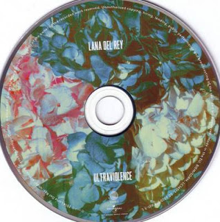
Lana Del Ray - Ultraviolence:
The idea of depression has been signified by the signifier of the black and white colour palette, creating a drained atmosphere, her sullen expression also signifies this. The idea of vulnerability has also been signified by the gripping of the car door paired with her solemn expression in the close up (on the back of the Digipak). There is also an unpretentious and simple feel to the Digipak , signified by her casual clothing, inexpensive car and the clear, simple, easy to read font. Her wavy hair and full makeup signify femininity and beauty, this is enforced by other signifiers, the narrow font that appears less bulky than a 'masculine' font and the slight rounded edges of certain letters. The floral pattern on the disc also signifies femininity whilst also signifying ideas of relaxation due to the bright and exotic look of the flowers.
Imagine Dragons - Night Visions:
The idea of loneliness has been signified by the signifiers of the extreme long shot of the lone figure, making them seem even smaller, and the small font of the track list that appears against a plain background. The feeling of despair has been signified by the grey colour palette, emphasising the idea of loneliness. There is a dream-like atmosphere that has been created by the signifiers of soft colours and soft lighting. The idea of spirituality has been signified by the clouds, mountain-like setting and the bright light emerging from the top left-hand corner.
Bastille - Bad Blood
Multiple signifiers within this Digipak signify the idea of danger, for example, the colour yellow that has connotations of warning, the headlights that that signify a sudden danger, as well as the running figure and night-time atmosphere. The idea of urgency has also been signified by the signifier of the blurred image. The triangle used to replace the letter 'A' also signifies danger as this is the shape of warning signs. It also signifies masculinity, with upwards triangles being associated with men and upside-down triangles being associated with women, this can also refer to the fact that this is an all-male band. The all capital text signifies strength and fearlessness, juxtaposing the ideas of danger presented. Mystery has also been signified by the night location as well as the black disc.
Lana Del Ray - Ultraviolence:
The idea of depression has been signified by the signifier of the black and white colour palette, creating a drained atmosphere, her sullen expression also signifies this. The idea of vulnerability has also been signified by the gripping of the car door paired with her solemn expression in the close up (on the back of the Digipak). There is also an unpretentious and simple feel to the Digipak , signified by her casual clothing, inexpensive car and the clear, simple, easy to read font. Her wavy hair and full makeup signify femininity and beauty, this is enforced by other signifiers, the narrow font that appears less bulky than a 'masculine' font and the slight rounded edges of certain letters. The floral pattern on the disc also signifies femininity whilst also signifying ideas of relaxation due to the bright and exotic look of the flowers.
Imagine Dragons - Night Visions:
The idea of loneliness has been signified by the signifiers of the extreme long shot of the lone figure, making them seem even smaller, and the small font of the track list that appears against a plain background. The feeling of despair has been signified by the grey colour palette, emphasising the idea of loneliness. There is a dream-like atmosphere that has been created by the signifiers of soft colours and soft lighting. The idea of spirituality has been signified by the clouds, mountain-like setting and the bright light emerging from the top left-hand corner.
Subscribe to:
Posts (Atom)