Final Music Video:
Final Digipak:
Final Magazine Advert:
I'm an A2 Media Studies student also studying Textiles and Photography. I am really passionate about Media Studies as I enjoy being creative and imaginative.
Showing posts with label Digipak. Show all posts
Friday, 22 April 2016
Friday, 18 December 2015
Finished Digipak
Today we finally finished our Digipak, arranging the four panels suitably. The front cover is on the top-left, the back on the top-right and the inside being the bottom two panels. Overall, I am really pleased with the end result as it reflects the mood that we wanted the album to convey. The monochrome colour palette helps to evoke a serious atmosphere which is typical of the indie genre whilst the colourful CD mirrors our up-beat song and colourful locations, such as Brick Lane.
Thursday, 10 December 2015
Digipak Front Cover Drafts
We chose to desaturate our image as we wanted the front, back and inside covers to contrast the bright, colourful CD. We also wanted a monochrome colour palette due to the album title, 'Noir', meaning 'black'. This darker colour palette encapsulates the themes of the album and our music video, that looks at the deteriorating mental state of the protagonist. This dark theme is also typical of the indie genre. After cropping our image to size, we added text - the artist name at the top and the album title beneath it. We then experimented with different fonts.
We wanted two different fonts for the artist name and the album name to make the cover more interesting. We wanted to choose a font for the artist's name that could be used on a range of products in order to reinforce their brand. We narrowed this font down to the two examples shown above. We specifically looked for fonts that had a decayed look to create a link to the grungy locations of our music video, such as Camden and Brick Lane. The idea of decay also reflects the deteriorating mental state of the protagonist in our music video. We decided to use the font on the right-hand side, called 'Birth of a Hero', as we felt that the font on the left was too bold and didn't reflect the fragile persona that we tried to create within our music video.
We then changed the positioning of the album name to find a composition that we liked. We felt that it fit better on the right-hand side (shown in the image on the left) instead of being centralised (shown on the right). Having the album name appear on the right looked neater and more professional as the text fit neatly into the dark space in the top right-hand corner of the image.
Finally, we looked at fonts for the album name. We wanted something unique as this would help to make our product stand out. For this reason, we felt that the font shown on the right was too plain so we decided to use the font on the left, called 'Atlantic Cruise'.
We wanted two different fonts for the artist name and the album name to make the cover more interesting. We wanted to choose a font for the artist's name that could be used on a range of products in order to reinforce their brand. We narrowed this font down to the two examples shown above. We specifically looked for fonts that had a decayed look to create a link to the grungy locations of our music video, such as Camden and Brick Lane. The idea of decay also reflects the deteriorating mental state of the protagonist in our music video. We decided to use the font on the right-hand side, called 'Birth of a Hero', as we felt that the font on the left was too bold and didn't reflect the fragile persona that we tried to create within our music video.
We then changed the positioning of the album name to find a composition that we liked. We felt that it fit better on the right-hand side (shown in the image on the left) instead of being centralised (shown on the right). Having the album name appear on the right looked neater and more professional as the text fit neatly into the dark space in the top right-hand corner of the image.
Finally, we looked at fonts for the album name. We wanted something unique as this would help to make our product stand out. For this reason, we felt that the font shown on the right was too plain so we decided to use the font on the left, called 'Atlantic Cruise'.
Wednesday, 9 December 2015
Finished Digipak Back Cover
After finalising the font for our Digipak back cover, we were able to add text and final touches to our chosen image. We wanted to keep our track listing very simple, thus the minimalist-style font, we then added diamond shapes between each track title to make it even easier to read. We wanted to create quite a open, spacious look with the track listing, this helped to add balance to the finished cover as the text isn't too concentrated. we chose to place the text at the bottom of the image so as to not obscure the artist's face, helping to add to the 'star image', the placement also balances out the dark bottom half of the image to create a more appealing cover.
We added a barcode, parental advisory sticker and copyright information in order to conform to the conventions of existing Digipaks. All of these elements help to make our product look more professional.
Below is our final Digipak back cover:
We added a barcode, parental advisory sticker and copyright information in order to conform to the conventions of existing Digipaks. All of these elements help to make our product look more professional.
Below is our final Digipak back cover:
Font Ideas - Digipak Back Cover
Today the group researched further into fonts for our Digipak, specifically for the track listing on the back cover. We used the website 'Da Font' to download different fonts as there was a large variety of different styles. We wanted a font that was unique to reflect our indie music video, however, we also need a practical, legible font as we needed our audience to be able to read the important information on our Digipak. We narrowed it down to the 6 fonts shown below-left, we tested each of them by typing out the name of one of our songs, 'Cerebellum', so that we could visualise what the Digipak would look like more easily.
We chose to use the font that is second from the bottom. We liked the slimline lettering as this was reminiscent of a fashion magazine, this would appeal to our younger, image-orientated audience.
Monday, 7 December 2015
Digipak Image Choices
We looked through our footage in order to find suitable still shots that we could use for our Digipak. We chose to use shots from our music video instead of taking new photographs as we wanted to create an obvious visual link across the two products, this would help to create a stronger brand and 'star image'. Below are the images that we chose:
Front Cover:
We Wanted to include the artist on the front cover to heighten the 'star image', we wanted the artist's image to be the audience's first impression of the Digipak. As we wanted the artist to be the focus we wanted to find a shot with a simple background, ruling out our bold Brick Lane location. We chose these two shots as they are close-ups, emphasising the artist. Ultimately, we chose the image on the left as the image on the right seemed too bland with just a plain black background. Our chosen image is more exciting due to a wider range of tones and textures, such as the brick wall on the right or the artist's denim jacket.
Back Cover:
For the back cover we chose two contrasting shots. By looking at existing products we noticed that Digipaks from the indie genre usually contain landscape shots, such as our river shot on the left, or images of the artist, like our shot on the right. We decided that the river shot would be better suited for the inside cover as we could stretch it across two panels to create a panoramic view, emphasising the scenic nature of the shot. We also thought that having a shot of the artist on the back cover would fit with the shot on the front cover, having the artist appear on both the front and back covers would create a stronger 'star image'.
Inside:
After deciding that the river shot would be suitable to use for the inside panels of the Digipak, we found a second shot of the opposite side of the river. We hope that when we put these two picture together, they will look as though they are one panoramic shot. We liked these shots as we wanted quite a simple image on the inside as we had planned to have a bold, colourful CD. We needed simple shots to allow the CD to remain the focus.
CD:
As we wanted a colourful CD we thought that our Brick Lane location would offer the bright colour palette that we were looking for. We found the graffiti shot shown on the left. However, we decided to use the ornate pattern, shown on the right, that we found in Camden. We chose it as the grandeur of its design perfectly contrasts the grungy style of our music video and other Digipak images. The circular pattern is also well suited to a CD.
Front Cover:
We Wanted to include the artist on the front cover to heighten the 'star image', we wanted the artist's image to be the audience's first impression of the Digipak. As we wanted the artist to be the focus we wanted to find a shot with a simple background, ruling out our bold Brick Lane location. We chose these two shots as they are close-ups, emphasising the artist. Ultimately, we chose the image on the left as the image on the right seemed too bland with just a plain black background. Our chosen image is more exciting due to a wider range of tones and textures, such as the brick wall on the right or the artist's denim jacket.
Back Cover:
For the back cover we chose two contrasting shots. By looking at existing products we noticed that Digipaks from the indie genre usually contain landscape shots, such as our river shot on the left, or images of the artist, like our shot on the right. We decided that the river shot would be better suited for the inside cover as we could stretch it across two panels to create a panoramic view, emphasising the scenic nature of the shot. We also thought that having a shot of the artist on the back cover would fit with the shot on the front cover, having the artist appear on both the front and back covers would create a stronger 'star image'.
Inside:
After deciding that the river shot would be suitable to use for the inside panels of the Digipak, we found a second shot of the opposite side of the river. We hope that when we put these two picture together, they will look as though they are one panoramic shot. We liked these shots as we wanted quite a simple image on the inside as we had planned to have a bold, colourful CD. We needed simple shots to allow the CD to remain the focus.
CD:
As we wanted a colourful CD we thought that our Brick Lane location would offer the bright colour palette that we were looking for. We found the graffiti shot shown on the left. However, we decided to use the ornate pattern, shown on the right, that we found in Camden. We chose it as the grandeur of its design perfectly contrasts the grungy style of our music video and other Digipak images. The circular pattern is also well suited to a CD.
Saturday, 5 December 2015
Font Ideas - Digipak
I decided to research font styles that we could use for our Digipak, specifically, for our band name or album name. I used Google to find interesting styles as well as a great website that I found that has many different fonts available for free download. Below are some of the styles that I particularly liked:
Font 1 - Haus:
I like the crisp quality of this font, the thin lines look sleek, sophisticated and professional whilst certain letters, 'A' for example, have been altered and are slightly more geometric, I like the interesting triangular shape and feel that if used on our Digipak, would make our name 'NOVA' look more unique.
Font 2:
I like the simple cut-out shapes used to form the letters of this font. I think that the thick, bold lettering would help to make our name stand out. I turned the font black and white as I think that it looks less childish and more sophisticated, in keeping with our artist's image. I think that the black and white font would also fit with our Digipak's monochrome colour palette.
Fonts 3-6:
I like these 'chalkboard' inspired fonts as I think the hand-drawn aspect would make our Digipak look more unique and personal. Out of the four, my favourite is 'Return to Sender', I like its simple look compared to the stylised, almost hard to read 'Chalk Hand Lettering'. I also like the horizontal lines within the letters that help to balance the vertical look created by the tall, thin letters.
Font 7 - Nova Solid:
I think that this font, coincidentally titled 'Nova Solid', would work well for our band name 'NOVA'. The boldness would help our name stand out as well as make it legible against the black and white image on the front cover. I like the angular lines as I feel that this signifies ideas of strength and power whilst still looking 'cool' and urban, hopefully appealing to our target audience.
Font 8 - Acne:
I like the thin, sleek look of this font as it seems fashion magazine-inspired, this would appeal to our target audience of teenagers and young adults, as this demographic, according to Young and Rubicam's idea of psychographics, is orientated to image, appearance and fashion.
Font 1 - Haus:
I like the crisp quality of this font, the thin lines look sleek, sophisticated and professional whilst certain letters, 'A' for example, have been altered and are slightly more geometric, I like the interesting triangular shape and feel that if used on our Digipak, would make our name 'NOVA' look more unique.
Font 2:
I like the simple cut-out shapes used to form the letters of this font. I think that the thick, bold lettering would help to make our name stand out. I turned the font black and white as I think that it looks less childish and more sophisticated, in keeping with our artist's image. I think that the black and white font would also fit with our Digipak's monochrome colour palette.
Fonts 3-6:
I like these 'chalkboard' inspired fonts as I think the hand-drawn aspect would make our Digipak look more unique and personal. Out of the four, my favourite is 'Return to Sender', I like its simple look compared to the stylised, almost hard to read 'Chalk Hand Lettering'. I also like the horizontal lines within the letters that help to balance the vertical look created by the tall, thin letters.
Font 7 - Nova Solid:
I think that this font, coincidentally titled 'Nova Solid', would work well for our band name 'NOVA'. The boldness would help our name stand out as well as make it legible against the black and white image on the front cover. I like the angular lines as I feel that this signifies ideas of strength and power whilst still looking 'cool' and urban, hopefully appealing to our target audience.
Font 8 - Acne:
I like the thin, sleek look of this font as it seems fashion magazine-inspired, this would appeal to our target audience of teenagers and young adults, as this demographic, according to Young and Rubicam's idea of psychographics, is orientated to image, appearance and fashion.
Designing Our Digipak
After creating a general plan of the look we want for our Digipak, we began looking through our footage for suitable images. We found various images that we could use, we will create multiple Digipaks and evaluate the options in order to select the best Digipak.
We decided to start creating our Digipak, starting with the disc. We obtained a still image from our Camden shoot (below) of an ornate pattern on the side of a building. I like the bright colours and think that this will help the CD to stand out against the black and white background images. We used Photoshop to turn the shot into a circular shape, suitable for a disc.
We also experimented with the back cover. We selected a shot of our artist (me) in order to add to the 'star image', relating to Richard Dyer's theory as well as Andrew Goodwin's music video theory, both of which state that close ups of the artist help to enforce their 'brand'. We turned the image black and white and then added our tracklist. Initially, our tracklist was on the left of the image in a vertical list (below-left), however, we then realised that we hadn't cropped the image to the correct Digipak dimensions. After cropping it, we moved the text so that it was at the bottom of the image (below-centre) where it could be read more easily. We then experimented with different fonts and decided to add diamond shaped bullet points (below-right) to separate each track title so that each one stood our more.
Below is our vlog from today, showing our Digipak creation process:
We decided to start creating our Digipak, starting with the disc. We obtained a still image from our Camden shoot (below) of an ornate pattern on the side of a building. I like the bright colours and think that this will help the CD to stand out against the black and white background images. We used Photoshop to turn the shot into a circular shape, suitable for a disc.
We also experimented with the back cover. We selected a shot of our artist (me) in order to add to the 'star image', relating to Richard Dyer's theory as well as Andrew Goodwin's music video theory, both of which state that close ups of the artist help to enforce their 'brand'. We turned the image black and white and then added our tracklist. Initially, our tracklist was on the left of the image in a vertical list (below-left), however, we then realised that we hadn't cropped the image to the correct Digipak dimensions. After cropping it, we moved the text so that it was at the bottom of the image (below-centre) where it could be read more easily. We then experimented with different fonts and decided to add diamond shaped bullet points (below-right) to separate each track title so that each one stood our more.
Below is our vlog from today, showing our Digipak creation process:
Friday, 4 December 2015
Initial Digipak Ideas
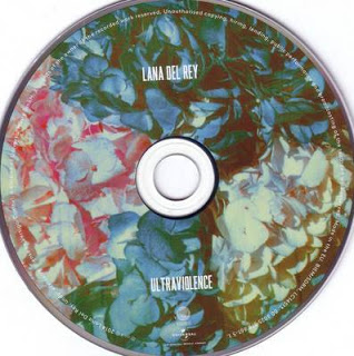
Today we started to plan our Digipak. Our general idea so far is to have black and white front/back covers and black and white inside panels with a bright, colourful disc. We thought that this would be perfect in representing the different locations used in our music video - the dark, grungy look of Camden compared to the bold, graffiti covered Brick Lane location. We also thought that a colourful disc would create an interesting juxtaposition due to the fact that our album is titled 'Noir', meaning 'black', further perpetuating the confusion that is portrayed in our music video. Our idea of a contrasting disc colour was inspired by the Digipak for Lana Del Ray's 'Ultraviolence'.
![]() |
| Our initial brainstorm |
Wednesday, 2 December 2015
Digipak Analysis
I decided to analyse an existing Digipak in order to understand its key components. Understanding the basic structure of a Digipak will help my group when we create our own. I looked at The Strokes' 'First Impressions of Earth'. The Strokes are an indie rock band, meaning that their Digipak could provide me with inspiration for our own product which is also from the indie genre.
I really like the idea of having a contrasting CD and think that this would help to make our Digipak more unique and appealing to our audience.
Wednesday, 25 November 2015
Existing Digipaks
I have started to look into existing Digipaks and album covers in order to understand their conventions. I used Saussure's theory of semiotics to gain a deeper understating of why certain images have been used, this will be useful when I come to design my own Digipak as I will be able to select specific signs to convey a desired meaning.
Bastille - Bad Blood
Multiple signifiers within this Digipak signify the idea of danger, for example, the colour yellow that has connotations of warning, the headlights that that signify a sudden danger, as well as the running figure and night-time atmosphere. The idea of urgency has also been signified by the signifier of the blurred image. The triangle used to replace the letter 'A' also signifies danger as this is the shape of warning signs. It also signifies masculinity, with upwards triangles being associated with men and upside-down triangles being associated with women, this can also refer to the fact that this is an all-male band. The all capital text signifies strength and fearlessness, juxtaposing the ideas of danger presented. Mystery has also been signified by the night location as well as the black disc.
Lana Del Ray - Ultraviolence:
The idea of depression has been signified by the signifier of the black and white colour palette, creating a drained atmosphere, her sullen expression also signifies this. The idea of vulnerability has also been signified by the gripping of the car door paired with her solemn expression in the close up (on the back of the Digipak). There is also an unpretentious and simple feel to the Digipak , signified by her casual clothing, inexpensive car and the clear, simple, easy to read font. Her wavy hair and full makeup signify femininity and beauty, this is enforced by other signifiers, the narrow font that appears less bulky than a 'masculine' font and the slight rounded edges of certain letters. The floral pattern on the disc also signifies femininity whilst also signifying ideas of relaxation due to the bright and exotic look of the flowers.
Imagine Dragons - Night Visions:
The idea of loneliness has been signified by the signifiers of the extreme long shot of the lone figure, making them seem even smaller, and the small font of the track list that appears against a plain background. The feeling of despair has been signified by the grey colour palette, emphasising the idea of loneliness. There is a dream-like atmosphere that has been created by the signifiers of soft colours and soft lighting. The idea of spirituality has been signified by the clouds, mountain-like setting and the bright light emerging from the top left-hand corner.
Bastille - Bad Blood
Multiple signifiers within this Digipak signify the idea of danger, for example, the colour yellow that has connotations of warning, the headlights that that signify a sudden danger, as well as the running figure and night-time atmosphere. The idea of urgency has also been signified by the signifier of the blurred image. The triangle used to replace the letter 'A' also signifies danger as this is the shape of warning signs. It also signifies masculinity, with upwards triangles being associated with men and upside-down triangles being associated with women, this can also refer to the fact that this is an all-male band. The all capital text signifies strength and fearlessness, juxtaposing the ideas of danger presented. Mystery has also been signified by the night location as well as the black disc.
Lana Del Ray - Ultraviolence:
The idea of depression has been signified by the signifier of the black and white colour palette, creating a drained atmosphere, her sullen expression also signifies this. The idea of vulnerability has also been signified by the gripping of the car door paired with her solemn expression in the close up (on the back of the Digipak). There is also an unpretentious and simple feel to the Digipak , signified by her casual clothing, inexpensive car and the clear, simple, easy to read font. Her wavy hair and full makeup signify femininity and beauty, this is enforced by other signifiers, the narrow font that appears less bulky than a 'masculine' font and the slight rounded edges of certain letters. The floral pattern on the disc also signifies femininity whilst also signifying ideas of relaxation due to the bright and exotic look of the flowers.
Imagine Dragons - Night Visions:
The idea of loneliness has been signified by the signifiers of the extreme long shot of the lone figure, making them seem even smaller, and the small font of the track list that appears against a plain background. The feeling of despair has been signified by the grey colour palette, emphasising the idea of loneliness. There is a dream-like atmosphere that has been created by the signifiers of soft colours and soft lighting. The idea of spirituality has been signified by the clouds, mountain-like setting and the bright light emerging from the top left-hand corner.
Digipaks
A Digipak is a style of optical disc (CD, DVD, etc.) packaging typically made from cardboard with one or more plastic trays attached that can hold discs, it is an alternative to the standard jewel case packaging.
The advantages of Digipaks over jewel cases include:
. More eco-friendly as less plastic is used
. More compact as they are made out of cardboard instead of thick plastic
. Easier to store and transport as they are lighter and thinner
. More hardwearing - jewel cases often shatter or snap
. More room for graphic display
Digipaks are also a lot more versatile than jewel cases, made from 300gsm card, they can have a matte, gloss or spot varnish, with lamination and embossing also available. The standard dimensions of a 4 panel Digipak are 139.5mm x 6mm x 125.5mm, they are also available with 6 and 8 panels.
Digipaks will usually contain:
. Album name
. Artist name
. Track list
. Featured tracks
. Logo
. Parental advisory label (if necessary)
. Social media information
. Reviews / Quotations
. Copyright information
. Produced / Written by information
![]() |
| Digipak - Loud (Rihanna) |
![]() |
| Jewel Case - Born to Die (Lana Del Ray) |
The advantages of Digipaks over jewel cases include:
. More eco-friendly as less plastic is used
. More compact as they are made out of cardboard instead of thick plastic
. Easier to store and transport as they are lighter and thinner
. More hardwearing - jewel cases often shatter or snap
. More room for graphic display
Digipaks are also a lot more versatile than jewel cases, made from 300gsm card, they can have a matte, gloss or spot varnish, with lamination and embossing also available. The standard dimensions of a 4 panel Digipak are 139.5mm x 6mm x 125.5mm, they are also available with 6 and 8 panels.
Digipaks will usually contain:
. Album name
. Artist name
. Track list
. Featured tracks
. Logo
. Parental advisory label (if necessary)
. Social media information
. Reviews / Quotations
. Copyright information
. Produced / Written by information
Subscribe to:
Posts (Atom)


