Saturday, 5 December 2015

Designing Our Digipak

After creating a general plan of the look we want for our Digipak, we began looking through our footage for suitable images. We found various images that we could use, we will create multiple Digipaks and evaluate the options in order to select the best Digipak.

We decided to start creating our Digipak, starting with the disc. We obtained a still image from our Camden shoot (below) of an ornate pattern on the side of a building. I like the bright colours and think that this will help the CD to stand out against the black and white background images. We used Photoshop to turn the shot into a circular shape, suitable for a disc.


We also experimented with the back cover. We selected a shot of our artist (me) in order to add to the 'star image', relating to Richard Dyer's theory as well as Andrew Goodwin's music video theory, both of which state that close ups of the artist help to enforce their 'brand'. We turned the image black and white and then added our tracklist. Initially, our tracklist was on the left of the image in a vertical list (below-left), however, we then realised that we hadn't cropped the image to the correct Digipak dimensions. After cropping it, we moved the text so that it was at the bottom of the image (below-centre) where it could be read more easily. We then experimented with different fonts and decided to add diamond shaped bullet points (below-right) to separate each track title so that each one stood our more.


Below is our vlog from today, showing our Digipak creation process:


Friday, 4 December 2015

Initial Digipak Ideas

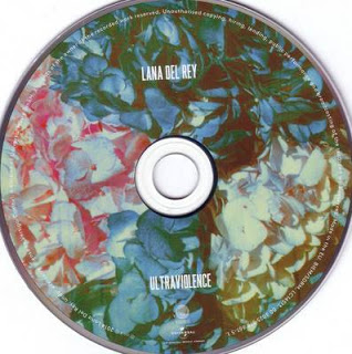
Today we started to plan our Digipak. Our general idea so far is to have black and white front/back covers and black and white inside panels with a bright, colourful disc. We thought that this would be perfect in representing the different locations used in our music video - the dark, grungy look of Camden compared to the bold, graffiti covered Brick Lane location. We also thought that a colourful disc would create an interesting juxtaposition due to the fact that our album is titled 'Noir', meaning 'black', further perpetuating the confusion that is portrayed in our music video. Our idea of a contrasting disc colour was inspired by the Digipak for Lana Del Ray's 'Ultraviolence'.

Our initial brainstorm

Wednesday, 2 December 2015

Digipak Analysis

I decided to analyse an existing Digipak in order to understand its key components. Understanding the basic structure of a Digipak will help my group when we create our own. I looked at The Strokes' 'First Impressions of Earth'. The Strokes are an indie rock band, meaning that their Digipak could provide me with inspiration for our own product which is also from the indie genre.


I really like the idea of having a contrasting CD and think that this would help to make our Digipak more unique and appealing to our audience.

Saturday, 28 November 2015

Framing and Composition - Brick Lane Shots

We framed our Brick Lane shots carefully so that our artist was the focus of each shot.


We thought about perspective and diagonal lines when framing this shot, the lines created where the walls meet the ground lead towards the focal point - the artist's face, emphasising their importance and reinforcing the 'star image'.


We centralised the focal point of this shot whilst also surrounding the subject, in this case with graffiti, this frames the subject and draws the viewer's eye whilst also balancing the empty space to create a more interesting shot.

Friday, 27 November 2015

Brick Lane Filming

Today we filmed Brick Lane. We wanted a shot of our artist (played by me) in front of a graffiti wall. We were unable to find the particular wall that we wanted, however, we were able to find other suitable locations. We wanted as bright a wall as possible in order to contrast the white outfit that I was wearing, we also wanted this location to contrast Camden as much as possible - the bright, vibrant colours of Brick Lane compared to the dark, night-time shots of Camden. Whilst we wanted these locations to contrast each other with their distinct styles, we wanted some common elements, for example, we wanted both locations to have a 'grungy', neglected look that helps to symbolise the disorientated mind-set of the character in the music video. We also managed to find graffiti (below) that was in keeping with our previous colour palettes, the contrast of the orange and blue similar to the lighting by the Camden river as well as the light filters used in the studio, thus tying all of our locations together.

 
We filmed some impromptu, unstoryboarded shots after seeing an interesting location (below). We were drawn to this doorway because of its particularly dilapidated state. I feel that the torn paper and grimy bricks help to add interesting textures that capture the atmosphere of the location whilst also mirroring the protagonist's deteriorating emotions as she tries to escape. It has also added to the feeling of being trapped as I am standing in a corner with my hands against the walls, appearing boxed in.


We continued the theme of being trapped by filming in front of this graffiti (below) that had two perpendicular walls extending out towards the camera, again, creating a boxed in effect. We liked the leaves on the floor as they added to the overall decayed feel of the location and, again, help to establish the colour palette - the orange leaves and blue graffiti.


We managed to get a successful tracking shot (below) that we had previously planned. We filmed this by hand, this has lent an intentional unsteady look to the shot. We didn't want the shot to be completely smooth as we wanted to mirror the rough look of the location. The unsteady shot also helps to mimic my movement as I walk towards the camera, making the shot appear natural and unstaged.


Below are some behind the scenes photographs from the shoot:


Here is our vlog where we talk in more depth about the events of the day:

Thursday, 26 November 2015

BFI Visit

Today we visited the British Film Institute where we received a talk from Tom Woodcock about the history of music videos. I think that this was very beneficial as I have learnt more about how music videos have progressed, the videos shown also provided inspiration for our own music video.

Here is the presentation that we were shown:


I found the video below, dating back to the 1930s, particularly influential. I really like the repetitive geometric shapes. I think that it has a very psychedelic, 'hypnotic' feel, relating to our song and music video. I think that the bright colours would work well in our Brick Lane location, we are hoping to film there on Friday. I think that we should keep this video in mind when explore the area on Friday as we will be looking for striking graffiti, I want to find something similar to the brightly coloured repeated shapes in this video.


We were also given tips on how to create a successful music video, this was helpful as we were able to see what tasks we have completed and what we still need to do. The 10 steps are as follows:

1. Asses Resources - Performers, technical kit, locations, props/costume (we have completed this step as we have researched all of these aspects and have made firm decisions that have been stated on our shooting schedule)

2. Warm Up - Lip synch practise, preliminary task (we have completed both of these tasks)

3. Recce - Limit locations, photos and footage, access to light and power (we have limited our music video to 4/5 locations, all of which have been researched, we are also using a battery powered light in order to avoid power supply issues)

4. Pitch - Treatment, moodboard (we have already pitched our idea and created moodboards)

5. Planning Beats Idea

6. Plan Everything - Storyboard/animatic, actors/locations and costumes prepared in advance, shooting schedule (we have thoroughly planned our music video, including all of the factors stated)

7. Shoot - Multiple angles (the locations that we have already filmed in were shot from many angles multiple times)

8. Edit - Synch up footage, upload rough cut and get feedback (as we haven't reached the editing stage we will have to refer back to these tips, it was useful to be told this in advance so that our editing process will be slightly easier)

9. Evidence - Research, photos, test footage, behind the scenes (we usually do all of these whilst we're filming)

10. Evaluation

Wednesday, 25 November 2015

Existing Digipaks

I have started to look into existing Digipaks and album covers in order to understand their conventions. I used Saussure's theory of semiotics to gain a deeper understating of why certain images have been used, this will be useful when I come to design my own Digipak as I will be able to select specific signs to convey a desired meaning.

Bastille - Bad Blood


Multiple signifiers within this Digipak signify the idea of danger, for example, the colour yellow that has connotations of warning, the headlights that that signify a sudden danger, as well as the running figure and night-time atmosphere. The idea of urgency has also been signified by the signifier of the blurred image. The triangle used to replace the letter 'A' also signifies danger as this is the shape of warning signs. It also signifies masculinity, with upwards triangles being associated with men and upside-down triangles being associated with women, this can also refer to the fact that this is an all-male band. The all capital text signifies strength and fearlessness, juxtaposing the ideas of danger presented. Mystery has also been signified by the night location as well as the black disc.


Lana Del Ray - Ultraviolence:


The idea of depression has been signified by the signifier of the black and white colour palette, creating a drained atmosphere, her sullen expression also signifies this. The idea of vulnerability has also been signified by the gripping of the car door paired with her solemn expression in the close up (on the back of the Digipak). There is also an unpretentious and simple feel to the Digipak , signified by her casual clothing, inexpensive car and the clear, simple, easy to read font. Her wavy hair and full makeup signify femininity and beauty, this is enforced by other signifiers, the narrow font that appears less bulky than a 'masculine' font and the slight rounded edges of certain letters. The floral pattern on the disc also signifies femininity whilst also signifying ideas of relaxation due to the bright and exotic look of the flowers.


Imagine Dragons - Night Visions:


The idea of loneliness has been signified by the signifiers of the extreme long shot of the lone figure, making them seem even smaller, and the small font of the track list that appears against a plain background. The feeling of despair has been signified by the grey colour palette, emphasising the idea of loneliness. There is a dream-like atmosphere that has been created by the signifiers of soft colours and soft lighting. The idea of spirituality has been signified by the clouds, mountain-like setting and the bright light emerging from the top left-hand corner.